Why I Built an Immersive Website: A Site You Step Into, Not Scroll Past
How layered depth, interactive scenes, and living details turn passive scrolling into active exploration while staying fast, SEO-friendly, and mobile-ready

Key Highlights: An immersive website uses layered depth, moving elements, and interactive scenes to turn passive scrolling into active exploration. It sits between classic web pages and full 3D experiences, loading fast (around 750 KB on phones) while making content memorable. Best for brands and founders who need to stand out with a story, not for shops with hundreds of products.
Most websites get scrolled past in three seconds. A visitor lands, scans the headline, scrolls once, then closes the tab. The page did its job on paper: fast load, clear copy, mobile-friendly. But nobody remembers it.
I rebuilt my own site so people step into it instead. The new version has layered depth, moving water, lights you switch on, and a monolith that opens to show every product at once. It still loads fast on a phone. It still ranks in search. But now visitors explore it instead of skimming past.

This article covers what an immersive website is, how it differs from a classic or 3D site, what each scene does, how it is built to stay fast, and when it is worth it for a business. I built the site, so this is written by the person who made it. That is also why it says plainly what it cannot do.
What an Immersive Website Actually Is
An immersive website is a site you step into instead of scrolling past. Instead of one long page of blocks, it moves you through a story scene by scene. Each scroll reveals depth, motion, and things to tap. Visitors explore rather than skim.
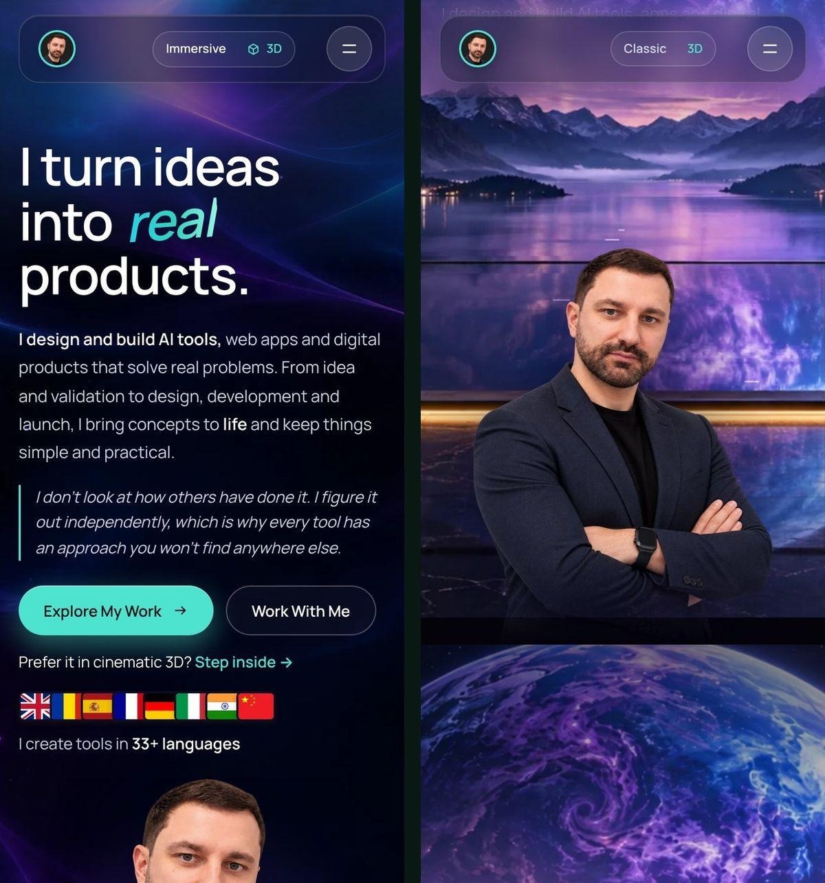
I rebuilt my own site in this style. It now sits next to the classic version and a full 3D version. The immersive version uses layered images that move at different speeds, real animated water, lights you switch on, and product scenes you tap through.
The immersive version of the site showcases 1000+ domains, 500+ AI tools, and 300+ apps. Each number counts up as you scroll past. Every product appears as a floating light around a tall monolith by the water. Tap a light and a card opens for that product. Tap the monolith, and it unfolds into five product screens at once, so a visitor sees everything I offer in one move.
What makes it immersive, rather than just animated:
- Layered depth. The room, the window, the lake, and the sky are separate layers that move at different speeds as you scroll. That is what gives the feeling of depth.
- Living details. Only the water moves, with ripples, mist, the odd shooting star, and a signature that writes itself. The trees, railings, and dock stay still.
- Things to do. Tap a light to open a product. Open the monolith to see everything at once. Flip a switch to light the room.
- A story, not a list. The page walks from the window, down the stairs, along the dock, to the products, the way of working, and the contact details.
An immersive website transforms passive scrolling into active exploration through layered depth, motion, and interactive elements.
Classic vs Immersive vs 3D Websites
My site now comes in three styles. A switch at the top of the page moves between them. They are three different levels, not three names for the same thing.

Feature | Classic | Immersive | 3D |
Feels like | A normal website | Walking through a film | Flying through a 3D world |
Built with | A normal page | Layered images and motion (2.5D) | A real 3D engine (WebGL) |
Speed on phones | Fastest | Fast | Heaviest |
Best for | Most businesses | Brands and founders who want to stand out | Showpiece launches and portfolios |
Images needed | Photos and screenshots | A set of custom scenes | 3D scenes and textures |
The honest way to describe the immersive style is that it feels 3D but loads like a normal site. If a page needs a camera that flies through a true 3D space, that is the 3D version, which is heavier and needs more from the phone.
The immersive approach sits between classic and full 3D. It offers depth without the performance cost of WebGL. For context on what makes a site perform well across all three approaches, I covered the full set of rules in my earlier website best practices guide.
A Walk Through the Immersive Site, Scene by Scene
The Window and the Numbers
A point of light opens into a room with a glass window over a lake. My signature writes itself on the glass. Scroll, and you pass through the window onto the balcony, where the headline appears. Then down the stairs as the numbers count up: 1000+ domains, 500+ AI tools, and 300+ apps.
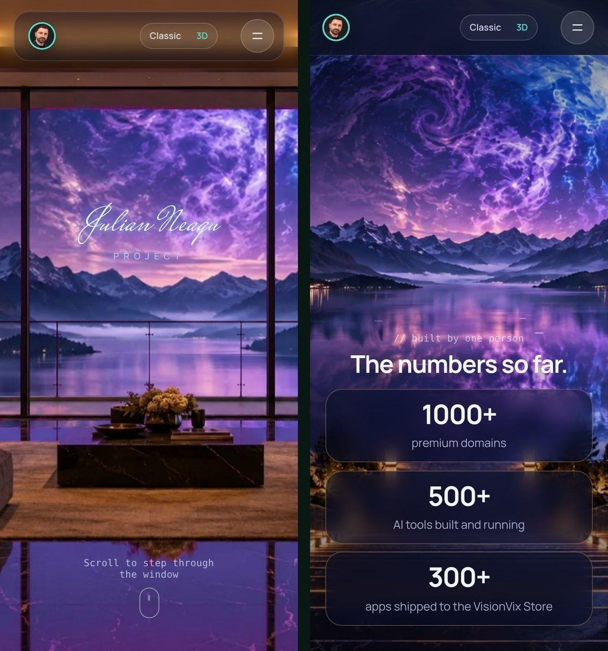
The scene uses sticky positioning. The background layers stay in place while you scroll. The scroll position moves the layers, the text, and the wipes between scenes. The water is drawn live on a canvas. A mask for each picture marks where the water is, so only the water ripples and everything in front of it stays still.
The Monolith: Every Light Opens a Product
Lights float around a tall monolith by the water. Tap one and a card opens for that product. Tap the monolith and it opens up into five product screens at once. A visitor sees everything I offer in one move, then closes it again with one tap.
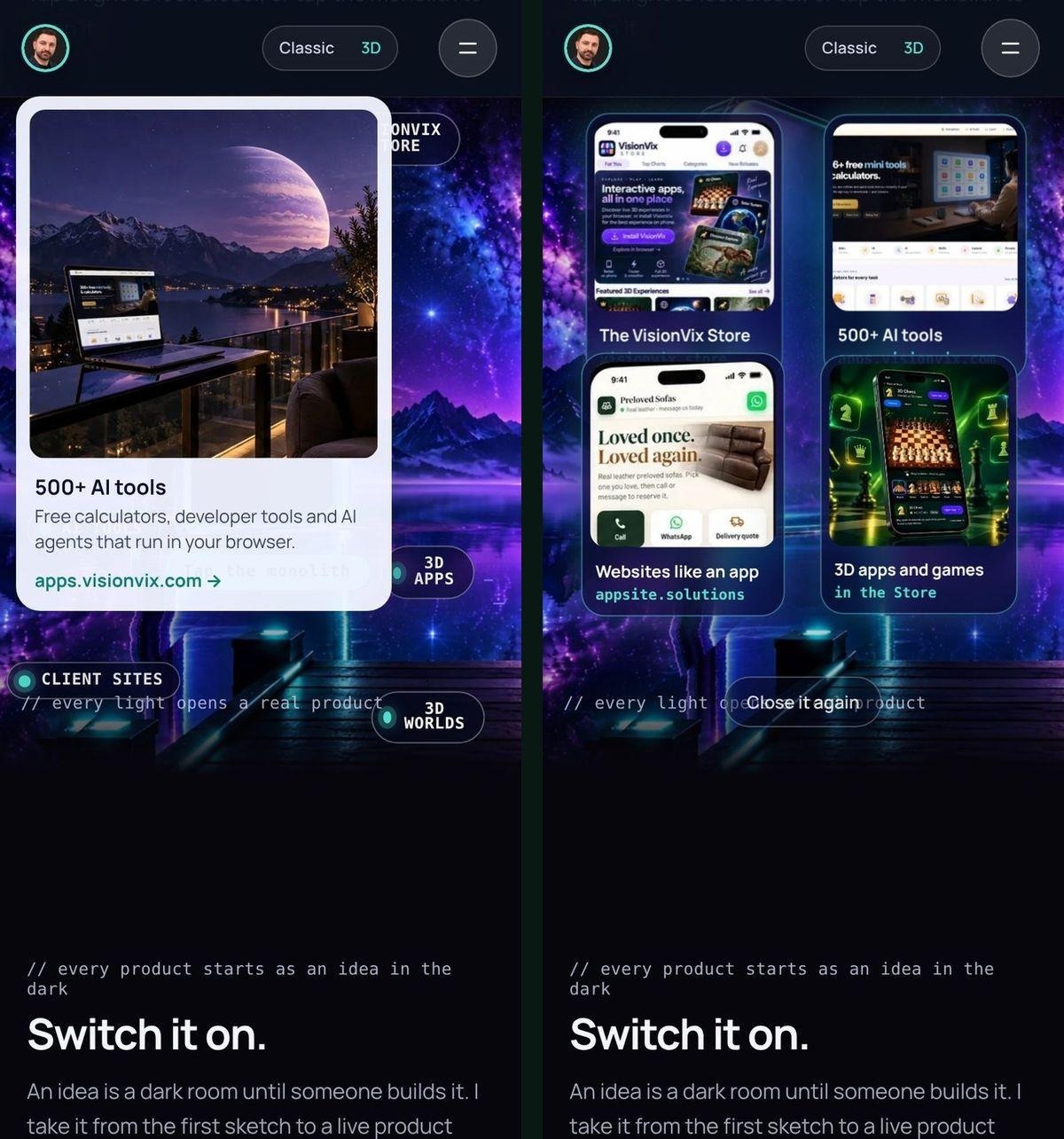
The monolith scene is the core of the site. It takes what would have been a grid of product cards and turns it into something visitors remember. Each light is a product. The monolith itself is the menu.
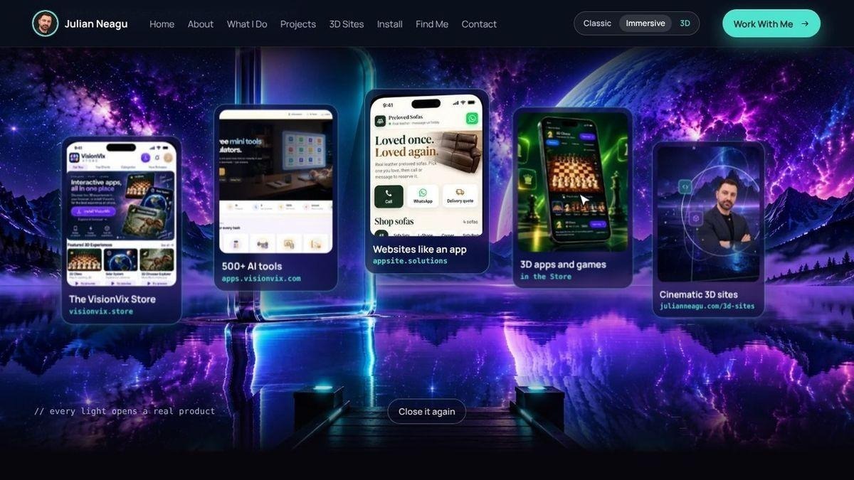
The same monolith scene looks even better on a desktop. The lights spread wider. The lake stretches further. But the mobile version still works, because the scene is designed mobile-first.
Switch It On
A dark room with a light switch. Flip it and the room lights up. It is a small moment, but it turns a line of text into something the visitor does with their own finger. The copy says "every product starts as an idea in the dark." The switch makes that line real.
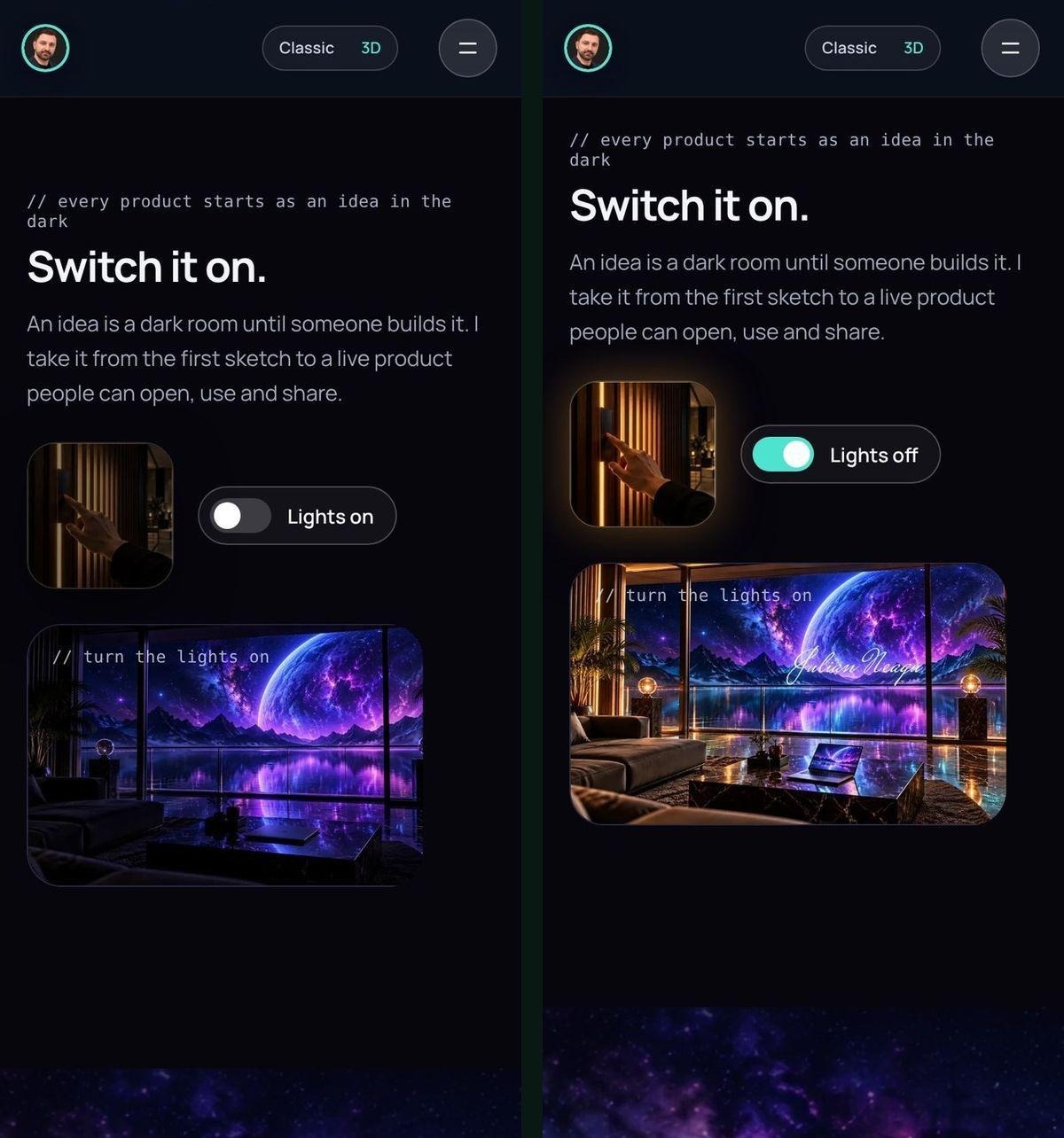
This scene is built with two images: the room dark and the room lit. A CSS transition fades between them when the switch is tapped. The switch itself is an SVG that rotates 90 degrees on tap.
How I Work, and the Contact
Eight stages float over the lake, from finding the gap to launching the product. They slide past as you scroll. The walk ends at the contact section, so the last thing a visitor sees is how to start.
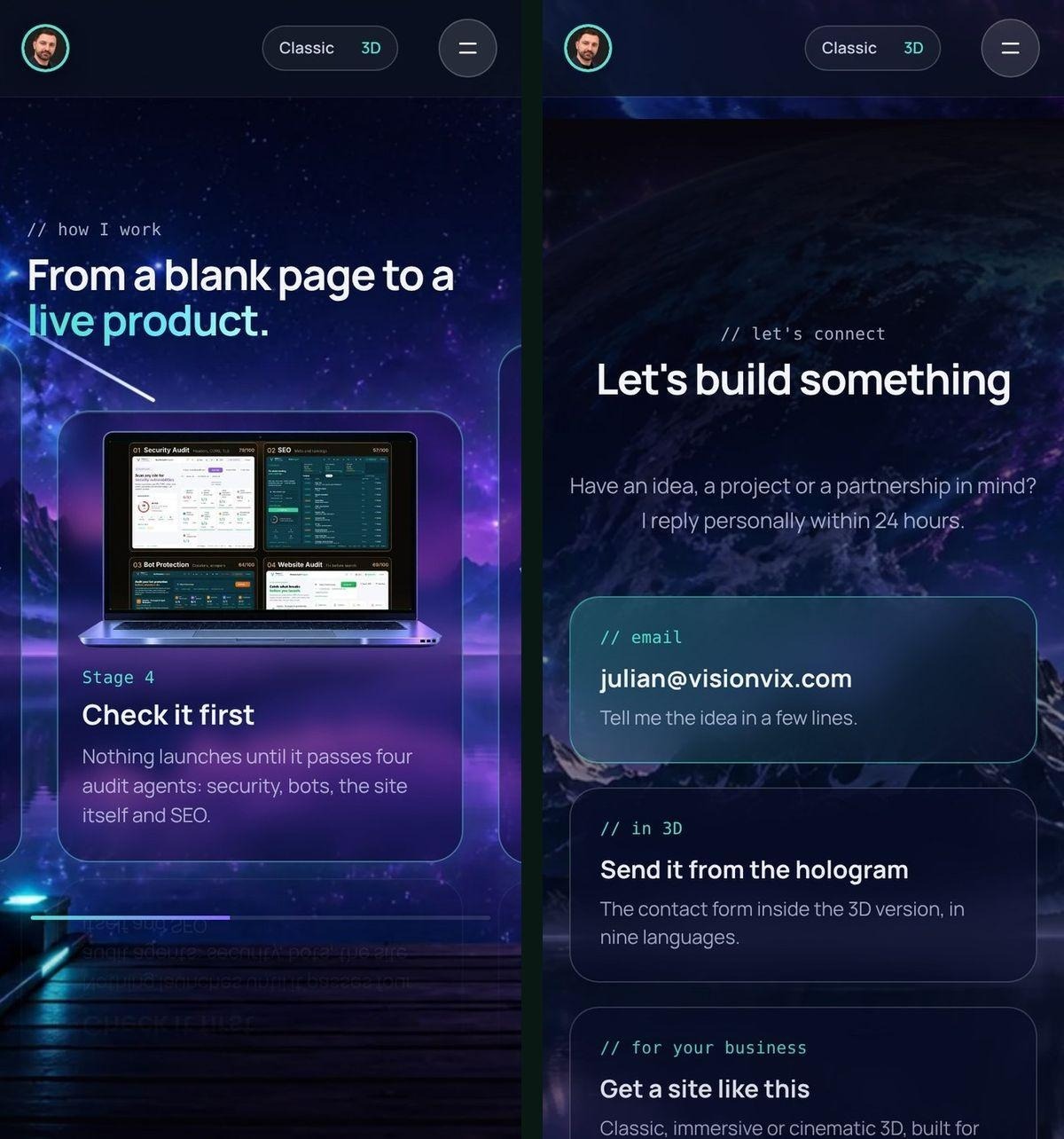
Each stage is a card with a headline, a short description, and an icon. The cards move at a different speed than the lake, which gives the same parallax depth effect as the earlier scenes. The contact section is a normal form. No tricks there. Just name, email, and message.
Why a Business Would Want an Immersive Website
People Explore Instead of Skimming
Each scene gives a reason to keep scrolling. More of the page actually gets seen. A visitor who opens a monolith or switches on a light stays longer than a visitor who lands on a grid of product cards.
This matters for conversion. A visitor who sees the whole page is more likely to understand what you offer and how to get it. The immersive format does not replace good copy or a clear call to action. It just makes sure the visitor sticks around long enough to read it.
It Is Remembered
A visitor who opens a monolith or switches on a light remembers the brand behind it. That is the real value of an immersive site. Not just traffic, but recall.
People explore instead of skimming. Each scene gives a reason to keep scrolling, so more of the page actually gets seen.
When a founder or brand needs to stand out in a crowded space, being remembered is the first problem to solve. An immersive site solves it by turning the website itself into the product demo.
It Explains, Not Just Lists
The scene-by-scene format suits a story: who you are, what you make, how you work. A classic site lists features. An immersive site walks through the journey.
This works best for businesses where the founder is the brand, or where the product is part of a bigger vision. For shops with hundreds of products or daily-use pages, a classic site is still the right choice.
It Still Converts
The basics of a good page still apply: a clear headline, one main action, and an easy way to get in touch. An immersive site keeps every one of them. The immersive format does not replace structure. It enhances it.
For a full breakdown of how to apply SEO best practices to any site style, I walked through the rules in an earlier guide. The short version: real HTML text, proper heading structure, and fast load times still matter.
How I Built It, in Plain Words
There is no 3D engine on the immersive page. It is a normal web page with a few tricks.
Custom Scene Images
Each scene is a set of pictures made for this site: the room, the balcony, the stairs, the dock, the monolith, and the stages over the lake. The pictures are layered in CSS, not stitched together in one big image file.
This lets the browser load only what it needs. A visitor on a phone gets smaller copies of every picture. Images below the screen load only when needed. The moving water stops drawing when it is off screen.
Water That Moves on Its Own
The water is drawn live on a canvas. A shader runs a ripple effect on every frame. A mask for each picture marks where the water is, so only the water ripples and everything in front of it stays still.
The water adds weight to the page, but not much. The shader is around 200 lines of code. The canvas draws at 30 frames per second on most phones. On slower devices, the frame rate drops, but the page still loads.
Real Text
Headlines and copy are normal HTML text, not words baked into pictures. That means search engines can read them. Screen readers can read them. The visitor can select and copy them.
This is where an immersive site differs from a video or a full 3D scene. The text is still text. The headings are still headings. The page structure is still readable by Google.
Speed Was the Rule From the Start
Phones get smaller copies of every picture. Images below the screen load only when needed. The moving water stops drawing when it is off screen. In my tests, the page needs about 750 KB to open on a phone.
The immersive version of julianneagu.com loads in approximately 750 KB on phones.
Google's Core Web Vitals are a good guide to what "fast" means. The immersive site passes all three metrics: Largest Contentful Paint under 2.5 seconds, First Input Delay under 100 milliseconds, and Cumulative Layout Shift under 0.1.
The page also respects prefers-reduced-motion settings for accessibility. If a visitor has that setting turned on, the water stops moving and the parallax effect turns off. The page still works. It just stops moving.
When an Immersive Website Is Worth It
An immersive website is not the right choice for every business. It is worth it when:
- The brand is the product. Founders, studios, agencies, and personal portfolios benefit most. If the website is the first impression and the main sales tool, immersive makes sense.
- The story matters. If the visitor needs to understand a journey, a process, or a vision, the scene-by-scene format helps. If the visitor just needs to click "buy now" on a grid of products, a classic site is faster.
- Standing out is the goal. In a crowded space, being remembered is the first problem. An immersive site solves that problem.
An immersive website is not worth it when:
- Speed is the only metric. A classic site is always faster. If the visitor knows what they want and just needs to find it, a classic site wins.
- The content changes daily. An immersive site is built around custom scenes. If the content changes every day, the scenes would need to change every day. That is too much work.
- The product list is long. A shop with 500 SKUs does not need a monolith. It needs filters, search, and a fast checkout.
Honest Limitations
An immersive website is heavier than a classic site. It takes longer to build. It needs custom scenes, not stock photos. It is harder to update.
If the goal is just to inform, a classic site is the better choice. If the goal is to be remembered, an immersive site is worth the extra weight.
The immersive version of my site took four weeks to build. The classic version took one. The 3D version took six. The immersive version sits in the middle: heavier than classic, lighter than 3D.
I document the full build process, including mistakes and what did not work, on my YouTube channel. The short version: sticky positioning, layered images, a canvas for the water, and real HTML text. No 3D engine. No heavy libraries.
Final Thought
An immersive website is not a replacement for good copy, clear design, or fast load times. It is an enhancement. It takes the same content and turns it into a story visitors step through instead of scrolling past.
If you are a founder, a brand, or a studio that needs to stand out, an immersive site might be worth the extra work. If you run a shop, a daily blog, or a utility page, a classic site is still the right choice.
The immersive version of my site is live now. The classic version is still there. The 3D version is there too. A visitor can switch between all three and decide which one fits their device and their attention span.
That is the honest pitch: three versions, three levels, one choice. The immersive version is the one visitors remember.
\
About the author
- Solo founder shipping AI tools at visionvix.com. I write about deterministic agent patterns, Next.js deployment, and how to ship 200 products in 4 months without burning out.
Comments
Join the discussionNo comments yet. Be the first to comment.
AI Agents & Agentic Systems
Deep dives into building, designing, and deploying AI agents, workflows, and agentic systems inside the VisionVix ecosystem.